Design.

Data-Driven User Experience Design, Graphic Design, & Creative Direction – Over 25 Years Of Experience

I’m a user experience advocate who loves to build usable & profitable digital products. From credit cards & personal loans to mobile apps & health care software solutions – it’s my job to translate business goals into tangible products for end users. This includes designing for those needs, building funnels to support those needs, and then iterating & optimizing to further bolster the UX & maximize revenue.

This journey frequently takes me from the C-suite to a developer's desk so I have to be agile and juggle business needs, the user's needs, as well as work within any confines such as development stacks or industry regulations.

View my Behance portfolio
View my LinkedIn profile

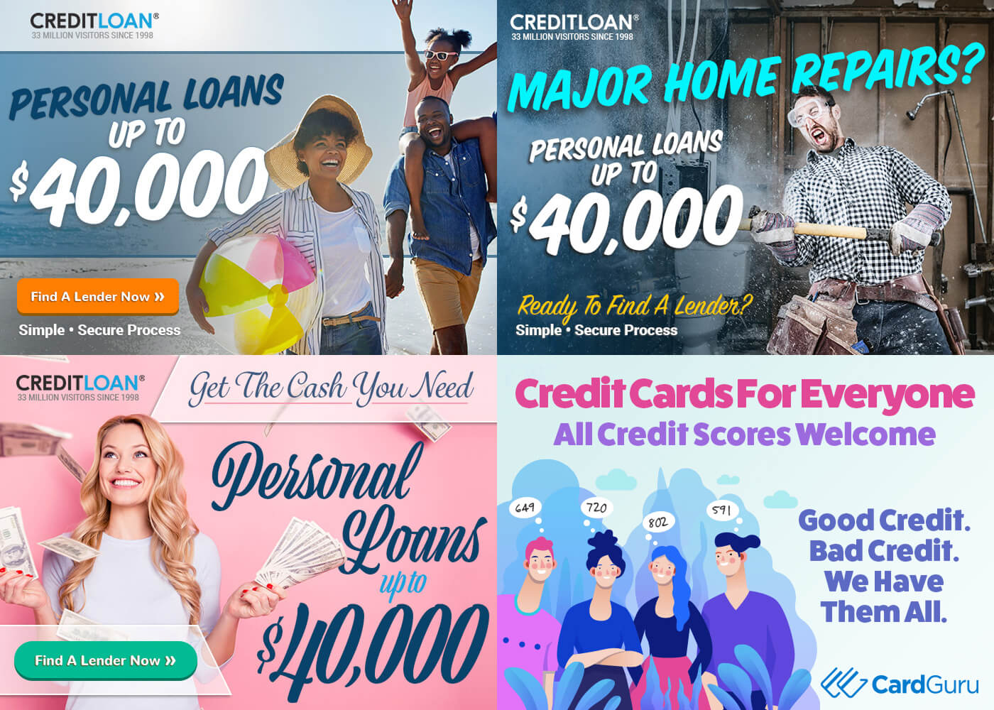
Email Campaign Header

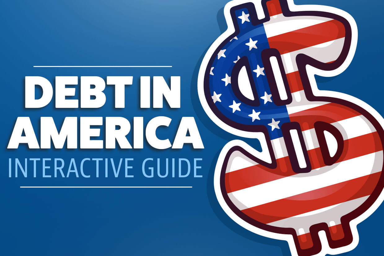
Article Intro Image

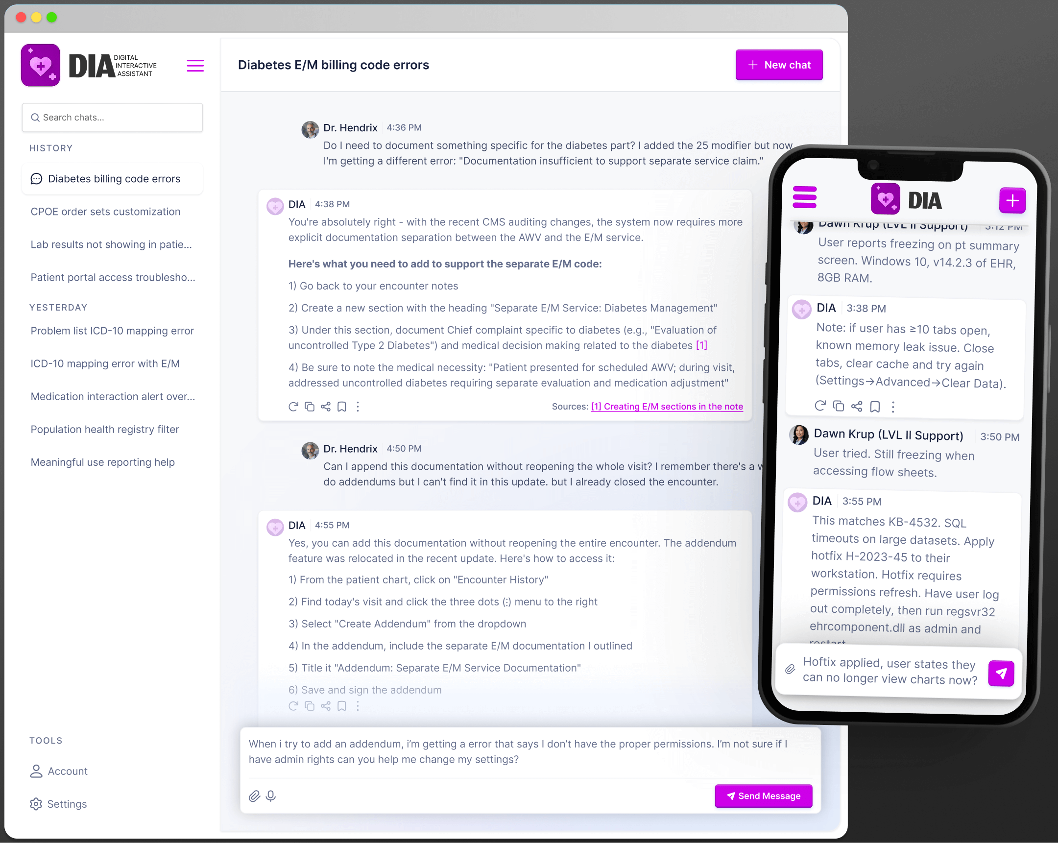
Article Header

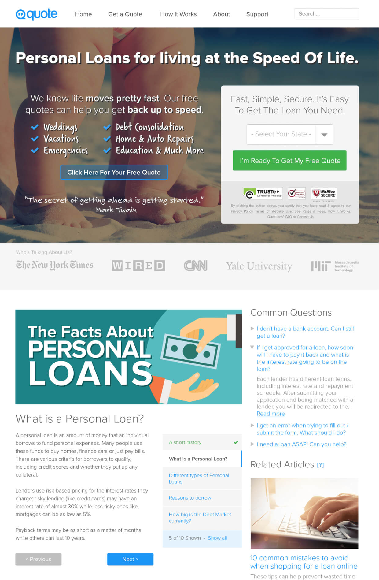
Quote.com

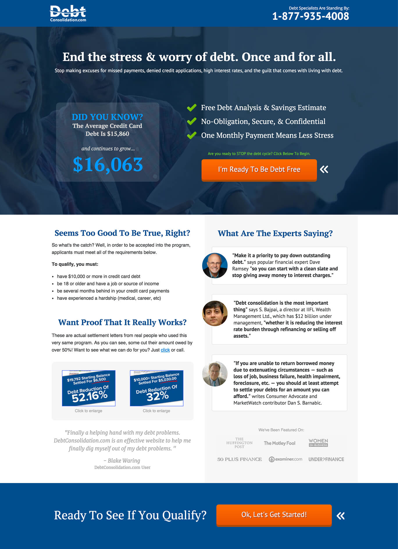
Landing Page Design

Next

What can I do?

Below is just a small sample of the skills I possess

Design – Product, UI, & Graphic

Graphic design, data-driven wireframing, mid-fidelity interactive prototypes, as well as full-fidelity U.I. layouts & design system creation.

User Experience & Conversion Rate Optimization

Optimization of funnels & touchpoints using A/B & Multivariate testing, heat & scroll maps, & analytics data.

Product & Project Management

Experience with Agile / SCRUM planning & Scrum master roles as well as Project Management / Product Owner roles.

Organic & Search Engine Optimization

Keyword optimization & opportunity sizing, content marketing, content & keyword gap analysis.

Marketing & Paid Advertising (PPC)

Automated funnels & creatives for TV & direct mail campaigns as well as multiple PPC and remarketing platforms.

Market.

End-to-End Funnel Creation & Customer Buying Cycle Understanding

What good is building a product if you can't sell it? From paid marketing to organic rankings, it's my goal to optimize conversions at every turn. From purchases to smaller goals such as collecting an email address or SMS opt-in – touchpoints allow a brand to stay in front of the users at every step of their journey.

Next

Case Study: PPC Landing Page Redesign

CreditLoan.com

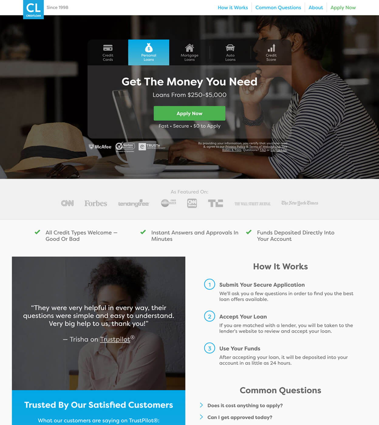
This landing page was used to connect customers to a vast network of financial service providers we worked with. These users were looking to get loans (personal, auto, mortgage) in addition to credit cards or credit scores. After many years of use and conversion rate optimization, it was determined that the landing page that was being used had been pushed to its max and was limiting our optimization efforts. While code refactoring would help with load times, there were a number of on-page elements that we realized we could either add, remove, or re-design to help us break through and unlock new optimization opportunities.

Project Details:

  • The page was used specifically for paid advertising – between various PPC platforms like Google Adwords and Facebook, we spent upwards of $25,000+ some days for paid traffic.
  • Serving thousands of visitors per day, which equated to millions per year – even the smallest of optimizations could result in substantial revenue increases.
  • The page was heavily focused on customers in the later stages of the buying cycle. These consumers have high intent, and little need for convincing.
  • Due to years of ongoing optimization efforts, we had huge amounts of data that we could lean on for insights.

Approach & Execution:

Knowing we had reached a point of diminishing returns in our optimization efforts, we agreed it was time to take a deeper look into the data that we had amassed over many years and millions of site visitors. This data included large data sets from resources like Google Analytics, click/heat/scroll maps, as well as session recordings. We also had years of experience in A/B and multivariate testing which also helped to inform our decisions. Using all of this data and knowledge, I set out to redesign the page from the ground up.

I’m a huge proponent of studying and optimizing for the customer buying cycle. Not every customer is ready to buy – and you need to account for all of these various modalities to help move the customer closer to the buying stage. In studying our most common funnel drop off/bounce areas, one of the biggest things that stood out to me was a clear lack of content for consumers who were in the earlier stages of the buying cycle. While the old page was very focused on people who knew what product they wanted, it didn’t take into account users who had knowledge gaps regarding the actual product they needed. I addressed this by including a “Common Questions” (aka FAQs) section as well as an assortment of longer articles that served to further explain the products and process in detail, helping the user to better understand what we offered and how it could meet their needs.

There was also a clear gap in gaining the trust of some potential customers who were further along in the buying cycle but had doubts about the products we offered or using CreditLoan as a product provider. I mitigated these concerns using resources like user testimonials, a social media widget, as well as a third party ratings provider. Social proof can act as a “tipping point” and can be extremely effective in quelling any concerns and converting a potential customer. In addition to content changes, I wanted to update the look and feel to not only be more contemporary, but also more user friendly. Larger fonts, better contrast, more clear language, and form optimization not only for an increase in conversions but also to help users input more accurate data (which of course lead to more revenue downstream).

In the end, my efforts helped convert more of the traffic that reached our page by catering to all phases of the buying cycle, in turn optimizing our ad spend by lowering our cost per conversion. With these optimizations, increases in revenue obviously followed. There was an instant boost in revenue immediately upon launch of the new design. And within 6 months, revenue had almost doubled. The lessons learned as well as the techniques, design, and patterns applied to this project also helped to inform future projects for the CreditLoan brand. Once launched, we continued to use behavioral user metrics to A/B and multivariate test ideas and continued to find items we could optimize.

Wireframe

Wireframing Mobile Views

Before

Page Before Redesign

After

Page After Redesign

Optimize.

Iterative Thinking & Constant Data Gathering – Site Analytics & User Behavior

Once you have a product and begin to market it, the next logical step is optimizing every touchpoint – across all marketing channels. Using both qualitative & quantitative data points, it’s my job to analyze them all and figure out how to further improve the product or increase conversion rates. Heatmaps, analytics, session recordings, user interviews – they all help to make the product even better while also maximizing revenue.

Next

Case Study: Organic Website Redesign

CreditLoan.com

This website/brand is one of those inspiring, almost stereotypical, rags to riches story. Started in 1998 by a guy in his spare bedroom offering personal loans, the humble owner continued to morph the site over the years adding more verticals while also juggling a full time job. He expanded his product offerings and revenue continued to grow. The site was eventually purchased for a substantial amount of money and the owner was retained to continue running the show. Sadly, due to its prolonged period of growth and limited resources, many of the products and pages on the site felt very “tacked on”. This of course hurt not only conversions due to poor UX, but also limited the site’s organic ranking possibilities. With advertising costs rising, and a desire to build a more loyal user base, I knew we needed to address our organic offerings.

Project Details:

  • Due to its age, the site layout/information architecture was less than ideal and the site felt very disjointed and was not very user friendly.
  • Many of the other ranking factors like aging backlinks, short-form articles, and slow-loading pages were dragging the site down and limiting its SEO potential.
  • Concerns of relying on PPC efforts for much of the brand’s annual revenue was a worrisome and expensive fact. Organic conversions are obviously much cheaper and help build loyalty with users.

Approach & Execution:

When I first dove into the project, I pored over years of data. Google Analytics data, SEO ranking reports, behavioral metrics like session recordings, heat maps, sales funnels, even user interview data. I wanted to fully understand where we stood as I had a mountain of data at my disposal. I had a room full of white-board painted walls and on them, I printed out the top ten competitors for the various verticals we wanted to compete in. My next step was to look at our competitors not only to see what they were doing, but also try to identify what we were doing right that they were not (to define our value proposition). I also performed competitive analyses of these competitors using various tools like SEM Rush to see if I could find insights into how they were ranking as high as they were.

In SEO, content is king as they say. I planned to come on strong with an aggressive content marketing plan that would allow us to rank not only for shorter, more popular (and competitive) search terms, but also targeting long tail keywords that can help a site to quickly move up the ranks if the content is actually valuable and not stuffed with keywords. We knew that Google wasn’t dumb, and the days of content farms churning out superficial 500 word articles was over. We needed to write content that would set us apart.

To accomplish this effort, we started working with renowned marketing “guru” Neil Patel and his team. Together, we outlined a content marketing strategy/team that allowed us to start creating large amounts of high quality, comprehensive, long-form articles that sometimes clocked in at over 5,000+ words. I created guidelines for an army of writers to use when writing in addition to using tools like Market Muse to formulaically build & “measure” an article's ranking ability (as well as our competitors). These efforts were crafted to help guide writers and prevent negative things like keyword stuffing, while also maximizing our content to include the right amount relevant short and long-tail keywords, as well as tangentially related topics that Google would commonly associate with a search term.

In this initial ramp up period of content creation, we were spending almost a quarter of a million dollars per quarter on content creation – research, writing, editing, graphic assets, etc. Once we had our content strategy machine churning, I shifted my attention back to the actual organic website to identify what changes we needed to make. While a redesign of the UI was a given to make it more contemporary and bring it inline with our competition, I knew I still needed to address the information architecture problem. Keyword stuffed pages with dated content, orphan pages with no way to navigate to them, as well as pages that could be either removed or their topics consolidated into either articles or optimized pages. I spent weeks auditing content as well as using any other metrics I could to determine how valuable that content currently was – Google Analytics, click/heat maps, session recordings, etc. I then used those insights to optimize the on-page content.

Once I was able to audit the current on-page content, I set about redesigning the UI to not only look better, but also better suit the various stages of the consumer’s buying cycle. Big, bright “Buy It Now” buttons are great for some users but not everyone is ready to buy yet. What about the person who doesn’t even know if the product they’re buying is what they need? Or the person who isn’t really sure if he can trust the CreditLoan brand? How do you help them close those gaps? Well I made sure to structure the pages to account for all of these users. Articles to help inform and build confidence that the user has found the right product for their needs. Or social proof to help build consumer confidence in our brand in the form of testimonials, ratings, or “as featured on” logos with well known pillars like Forbes, CNN, or The Wall Street Journal where our brand had been previously shared/backlinked. Including a wide variety of content helps to turn these users into customers.

After many months of reviewing historical data, building a content strategy, auditing the site’s pages, and redesigning the UI – we launched the new site and within weeks, we started to see amazing improvements in our organic rankings. And this was across all keyword group positions. A huge win as our brand’s reliance on our PPC channel was always a concern. We then started to see improvements across all metrics. Lower bounce rates, higher time on page, deeper page depth. Other KPIs also followed suit and in the first 6 months, the conversion rate was up 140%, transactions were up 337%, and revenue was up 325% (compared to the same 6 month period the previous year). Needless to say, the efforts paid off wonderfully.

From there, we continued to monitor users using tools like Hotjar and Full Story, performed A/B and multivariate testing, as well as optimized/implemented an “omni-channel” marketing approach that include email campaigns, SMS text messages, browser push notifications, paid retargeting marketing, paid lookalike audience efforts, and more.

After

After Redesign

Keywords

Keywords Performance

Mobile

Mobile Views

Competitors

Competitive Research

Ready to talk?

Visit my LinkedIn profile or my Behance portfolio for more information.