Breaking Through the Conversion Ceiling
How Strategic Landing Page Design Doubled Revenue While Leveraging Content Marketing to Master the Full Customer Journey
The Challenge: When Optimization Hits a Wall
Conversion Rate Optimization (CRO) changed the course of my design career sometime around 2010. When I first discovered A/B testing, it felt so amazing to finally be able to quantify the value of the design work I was doing. It also allowed me to become a better designer by not only having more data to make smarter decisions, but also learning from real world wins and loses. Some very bountiful, and some of course, very expensive. These dues paid are the price of experience.
My time with Branded Holdings was a blast. We worked in lead generation and traffic was plentiful. This in turn meant tons of optimization opportunities. And optimize we did. It was the secret that allowed a team of less than a dozen people to consistently generate 20-30 million per year in revenue. We had things tuned in pretty good. Or at least we thought we did.
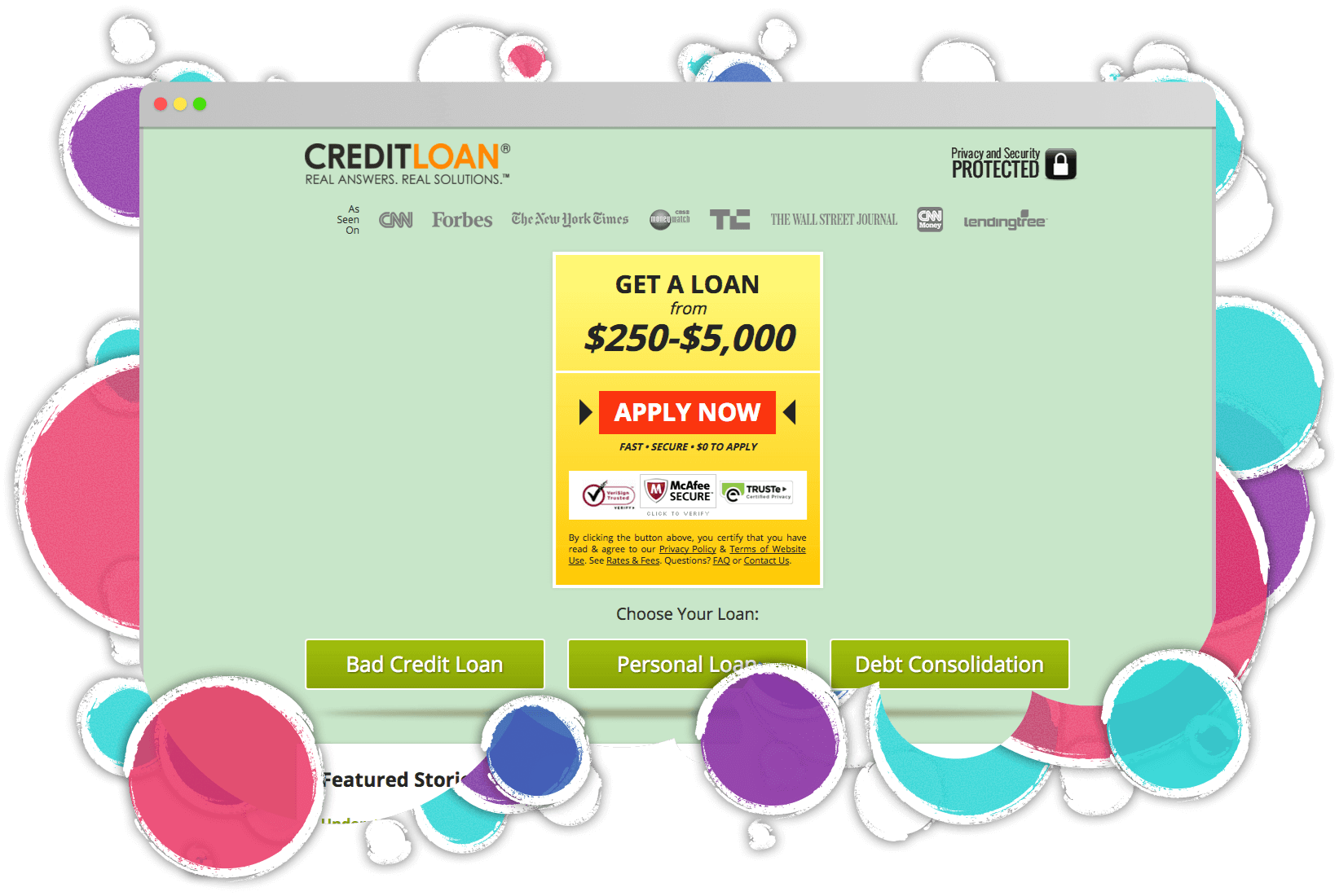
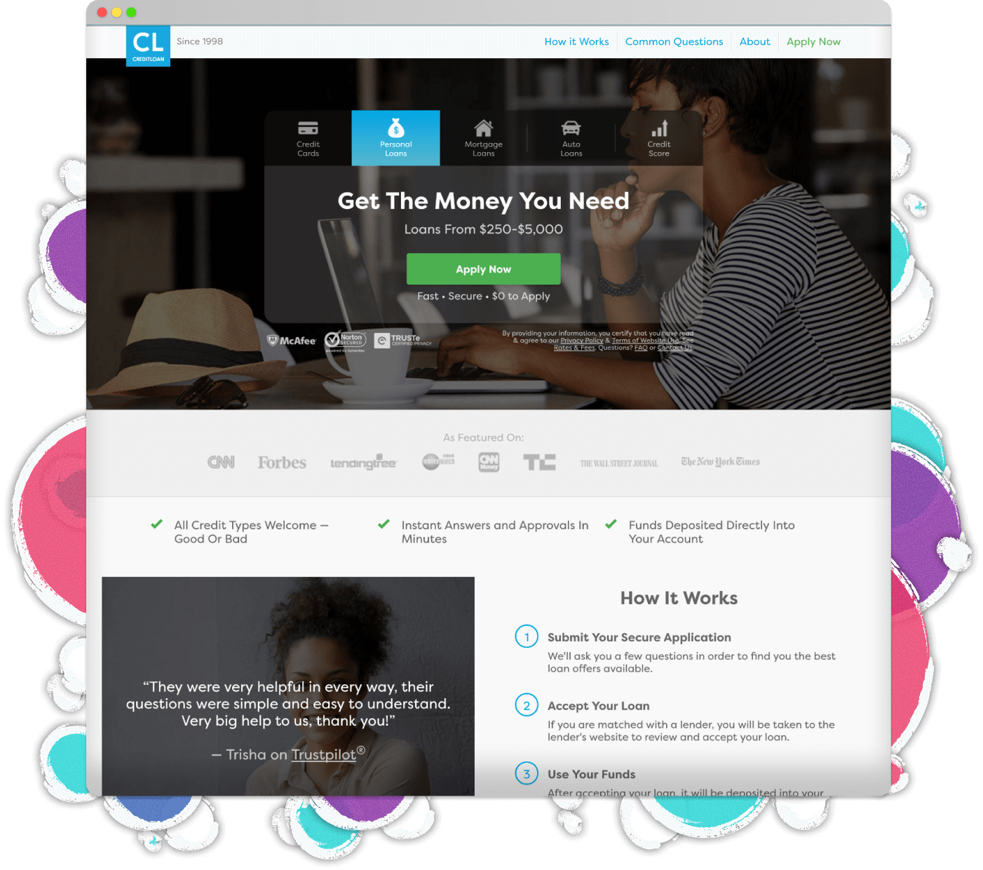
Sometimes, even when you're using every tool in the toolbox, you're bound to hit a ceiling. That's exactly where we found ourselves with our paid landing pages at CreditLoan.com. As I mentioned, we weren't just running basic tests. We had home brewed A/B and multivariate testing platforms humming alongside a web of analytics data were we tracked every user interaction we could legally get our hands on. Heat maps, user behavior analysis, you name it we tracked what we could. All day, every day.
But even with this powerhouse of optimization expertise and years of testing data, we needed something bigger than another round of design tweaks. It was time to think bigger about what these landing pages could really become as they had become our biggest blocker.
With paid marketing spend easily soaring past $25,000 daily across platforms like Google Ads and Facebook (10M+ annually), increased pressure from competition, incremental improvements weren't enough. The landing page wasn't converting like it could, but to unlock its full potential, the approach needed a complete rebuild from the ground up.
Industry
Focus
Impact
Challenge
What needed fixing:
- Landing pages optimized for expensive late-stage buyers, missing huge opportunities earlier in the journey
- Mobile-first imperative: 80% of our traffic came through mobile devices, yet the legacy design treated mobile almost as an afterthought
- Conversion rates that had plateaued despite continuous testing
- Trust signals that weren't effectively bridging the confidence gap
- User experience that didn't align with the sophistication of our financial products
- Downstream partner approval rates suffering because users weren't properly educated before applying
The Strategy: Start With What You Know, Then Blow It Up
When you're spending 25+ grand a day on traffic and seeing millions of visitors annually, even tiny improvements can have massive impacts. But this project wasn't about tiny improvements, it was about hunting for generational breakthroughs.
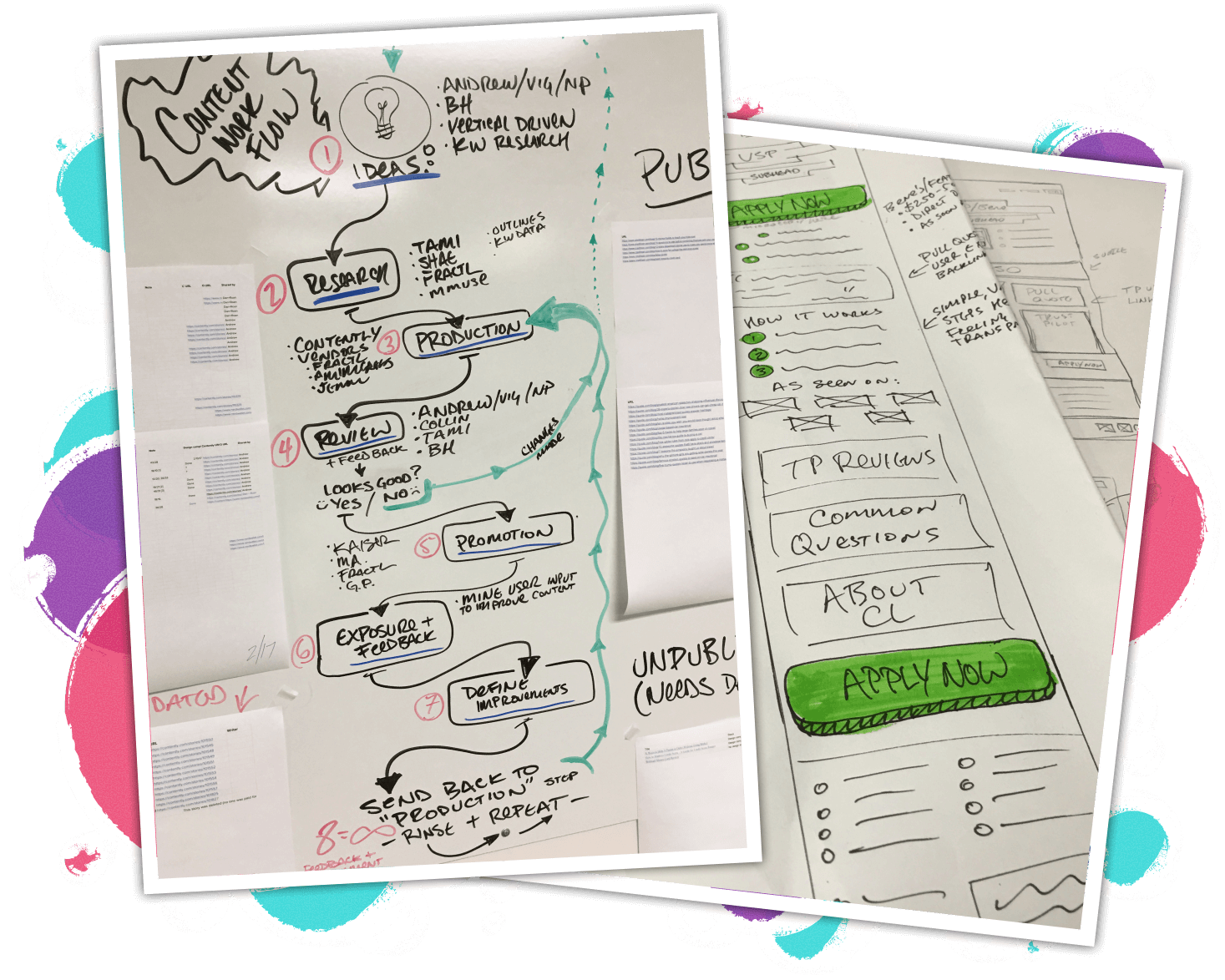
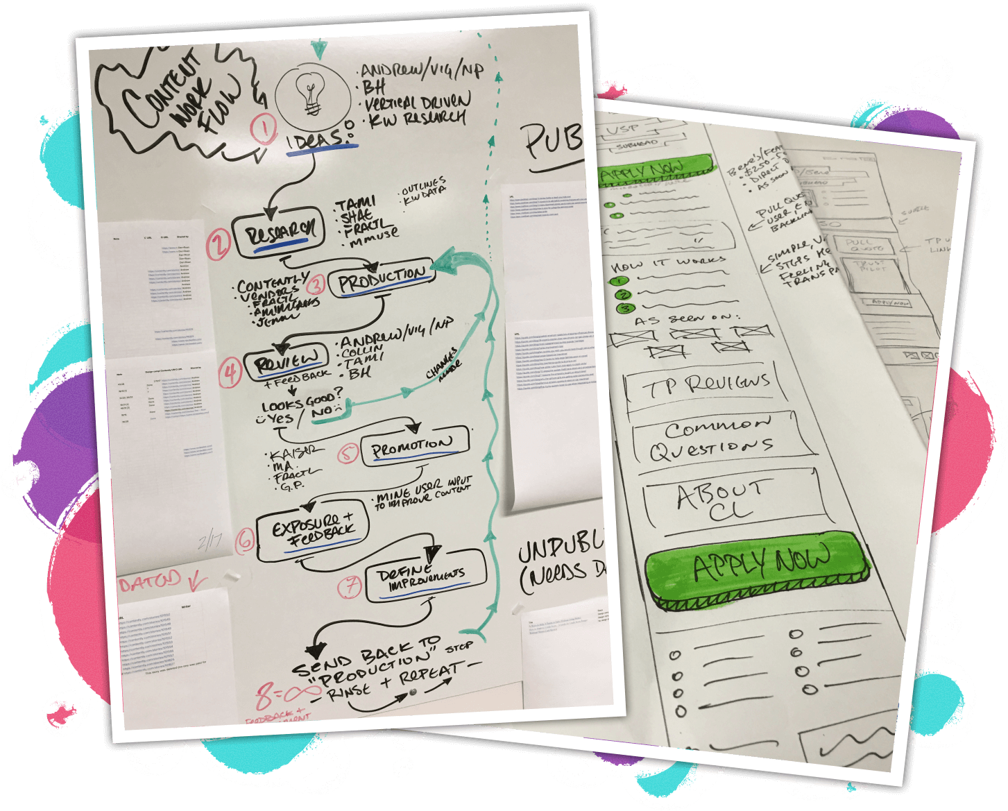
As Creative Director/VP of Product, I led the design, data discovery, and marketing strategy for this effort while also coordinating with our PPC, content creation, UX research, and development teams.
Our overall approach was to dive deep into the data, the user journey, and the content to find the hidden opportunities that could unlock the full potential of these landing pages.
First, a comprehensive audit of our historical data revealed:
- Years of Google Analytics insights
- Heat, click, and scroll maps showing user behavior patterns
- Thousands of session recordings
- A/B and multivariate testing results spanning multiple years
- Mobile vs. desktop behavior patterns showing drastically different user journeys
Our small team's CRO obsession meant we weren't just tracking user behavior, we were decoding the emotional psychology behind every click and scroll. We even partnered with Human Factors International (HFI), the global leaders in UX certification who've trained countless UX professionals worldwide, to level up our persuasion design game. Through their Persuasion, Emotion, and Trust (PET) framework, we learned to identify the real emotional triggers driving financial decisions. This wasn't about manipulating users, it was about understanding that behind every loan application is a human with fears, hopes, and specific emotional needs that good design should address.
We're not talking about building dark patterns here. Yuck. I'm talking about building hyper-personalized funnels for segments because I know exactly where they stand in their purchasing journey and what sort of emotions, doubts, or fears people in that stage commonly encounter. These much more personalized flows inherently allow easier soft-sell and cross-sell marketing, higher conversion rates, as well as higher retention rates. This project served as a great way to level up the entire team's understanding of these concepts. We focused heavily on educating the team on the importance of understanding omni channel marketing, funnels, and the full customer journey.
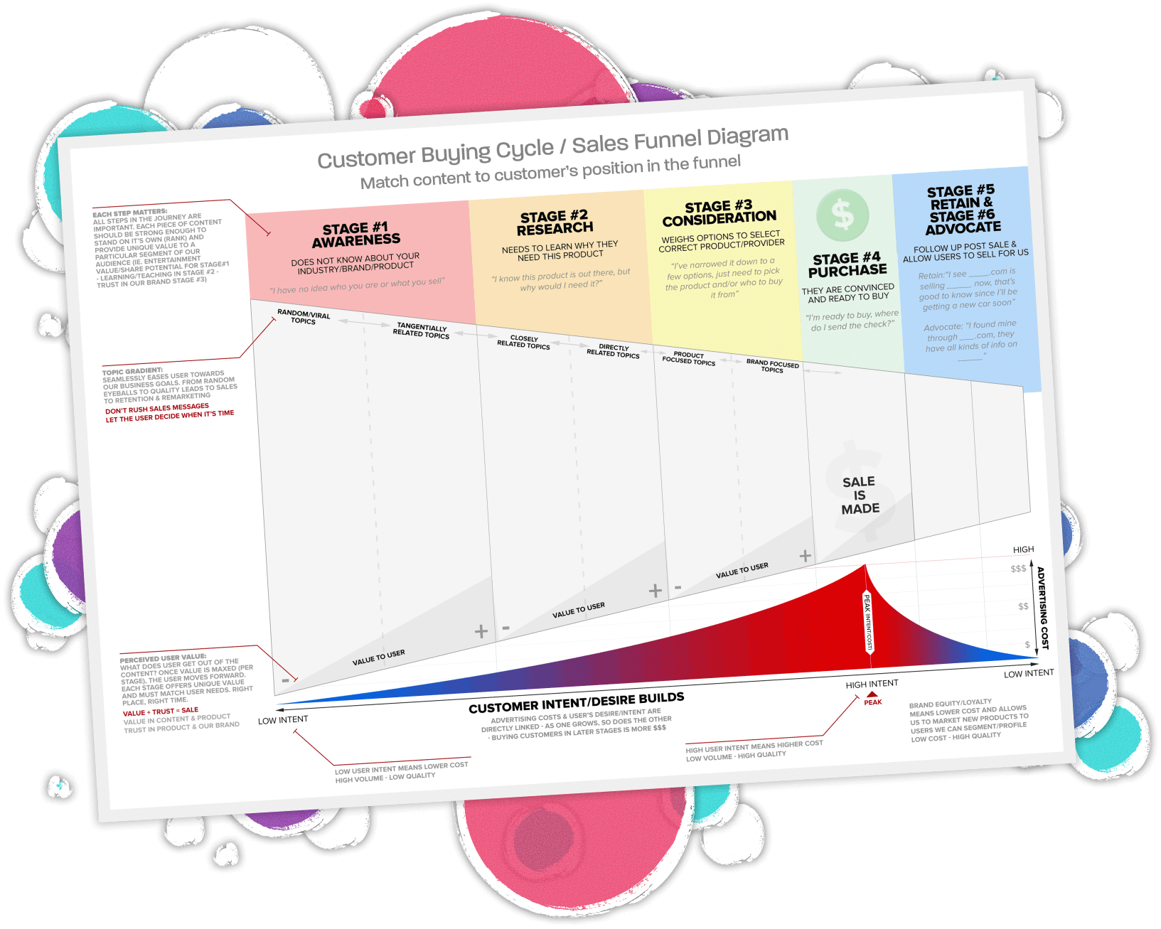
The Secret Sauce: Understanding the Full Customer Journey
When you're used to throwing money at paid marketing, it's easy to get lazy because your audience tends to be very quick to convert. But we knew we needed to figure out a way to somehow help our users who weren't ready to convert. Users who scrolled past the fold weren't lost causes - they were information seekers who converted at dramatically higher rates when they found answers to their questions. We needed to start answering those questions and keeping those users. Especially because we paid for them.
Our landing pages were laser-focused on late stage, ready-to-buy customers, but that's not how most people shop for financial products. Here's what the analysis revealed about the real journey:
1. Early Stage: The Knowledge Seekers (40% of traffic)
Users who know they need financial help but aren't sure which product fits their needs. They're looking for guidance, not just a submit button. These users had the lowest acquisition cost but highest lifetime value when properly nurtured.2. Middle Stage: The Comparison Shoppers (35% of traffic)
Visitors who understand their options but need confidence in their choice. They're weighing alternatives and looking for validation. Mobile users in this stage showed unique behaviors - screenshot-taking patterns and return visits from different devices.3. Late Stage: The Ready-to-Apply Folks (25% of traffic)
The traditional focus. The high-intent users who know exactly what they want and just need a smooth, secure path to apply. But even these high-intent users needed trust signals, with the majority checking for security badges or user reviews before form submission.The financial customer journey starts with users seeking guidance and education before seeing application forms. They then progress into the comparing and confidence phases. Once ready-to-apply, they still need assurance they can proceed safely. Trust is so critical in building lifetime value. After the conversion, retention becomes an enormously critical piece of the funnel. It's far cheaper to keep a customer than it is to acquire them.
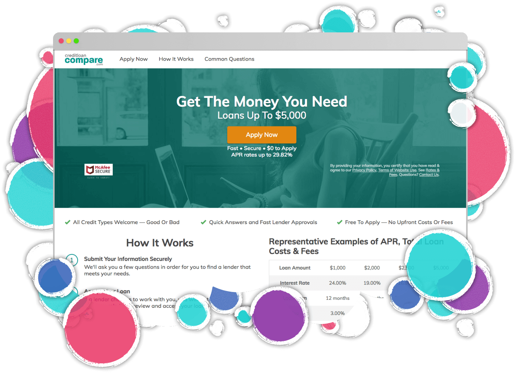
Implementation: Building for Every Stage
The redesign strategy centered on four core improvements, each one mapped to actual user needs we'd discovered in the data - because good design meets people where they are, not where you want them to be.
Knowledge Enhancement
Research revealed visitors needed answers before they'd commit to applying. We built a strategic "Common Questions" section targeting their most pressing concerns, positioned precisely where scroll depth data showed maximum impact. Users who made it halfway down were significantly more likely to convert when their specific questions got answered. Intuitive product comparison tools and clear explainers kept users informed without breaking their momentum toward conversion.
Trust Building
Financial decisions demand confidence, so we engineered a multi-layered credibility system. Customer testimonials provided social proof while an active social media feed demonstrated community engagement. Third-party ratings and features in major financial publications added institutional validation. A/B testing uncovered fascinating psychological triggers: stock photos with children boosted conversions. As does avoiding direct eye contact with stock images. Eyes looking toward CTAs delivered meaningful lifts. And pointing hands amplified impact further.
Personalization at Scale
We killed the old model of maintaining hundreds of static pages. Instead, dynamic landing pages automatically adapted messaging, imagery, and content based on visitor intent. Smart personalization through query string parameters in shortened URLs let us dynamically insert user names from email campaigns while keeping URLs clean. A seemingly minor touch that drove impressive engagement gains. Personal loan seekers saw articles to help educate and progress them further in our funnel while auto loan prospects got timely and targeted cross-sell content. All of it highly personalized. This flexibility didn't just boost conversions - it revolutionized our marketing velocity, letting us test and launch new campaigns in days instead of weeks.
Visual & UX Optimization
The final transformation layer addressed both aesthetics and functionality. We modernized the design language while keeping conversion at the core - larger fonts, enhanced contrast ratios, improved readability across all devices. Mobile-first form engineering became our religion: with 80% mobile traffic, we obsessed over thumb-friendly tap targets, optimized form fields for mobile keyboards, and achieved the holy grail - mobile/desktop conversion parity in financial services. Simplified form fields didn't just improve completion rates; they captured cleaner data, creating downstream benefits for both user experience and partner approval rates.
Breaking Free from the "Rental" Trap
The plan was straightforward: stop competing for expensive, high-intent keywords where everyone else was fighting. Instead, we'd use our content infrastructure to go after cheaper, early-stage traffic and nurture them through the funnel. Our paid team could finally bid on informational queries because we had the content to educate users, and the omnichannel setup to stay with them until they were ready to convert.
Traditional paid advertising with poor funnels is like renting an apartment. Every month, you're starting from zero, paying full price to reach the same customers again and again. You're not building any customer equity. Just like renting, you're paying premium prices without building any long-term value. Not exactly a recipe for sustainable growth, right? There had to be a better way.
This content foundation meant we could completely rethink our paid strategy. Instead of competing for expensive high-intent keywords like everyone else, we started bidding on cheaper, early-stage search terms. We had the infrastructure to nurture these users, the content to educate them, the omnichannel setup to stay connected, and the tracking to optimize every touchpoint. Why pay premium prices for ready-to-buy traffic when we could capture users earlier and guide them through their journey?
Our omnichannel orchestration included:
- Email drip campaigns with industry-beating open rates
- SMS campaigns delivering timely, personalized financial tips
- Browser push notifications for rate updates and application reminders
- Native iOS/Android app pushes for existing customers
- Retargeting across display and social networks with sequential messaging
- Content marketing articles answering every conceivable financial question
Content is Critical to Casual Conversations and Conversions
The transformation completely changed our relationship with both users and lending partners. By guiding casual browsers through personalized educational touchpoints instead of pushing them straight to application forms, we transformed them into qualified applicants who actually understood what they were applying for. Our lending partners noticed immediately - approval rates shot up, and they started bidding aggressively for our leads because the quality was so consistently high. Instead of the traditional all-or-nothing landing page that either converted or lost users forever, we created multiple natural conversion opportunities throughout the journey. This meant users could engage with us when they were ready, not when we demanded it.
Educational content became our secret weapon in transforming the traditional lending funnel. Instead of immediately pushing visitors toward application forms, we created a journey that taught them how to improve credit scores, understand complex lending terms, and make more informed financial decisions. By integrating targeted SMS and email campaigns that focused on genuinely helpful content rather than promotional messaging, we built meaningful ongoing conversations with our audience. This shift from transactional marketing to relationship building wasn't just about being nice - it fundamentally changed how leads moved through our pipeline and dramatically improved the quality of applications our lending partners received.
The Results: Impact Was Immediate & Substantial
This strategic shift fundamentally transformed our business model. Moving from a costly acquisition-focused approach to a more sustainable retention strategy. The numbers tell the story: customer acquisition costs dropped dramatically within the first quarter, while retention rates saw impressive improvements. By building lasting relationships with our audience, we not only reduced acquisition spending but also saw customer lifetime value increase substantially, proving that investing heavily in retention pays dividends.
- Revenue doubled within 6 months with immediate step-change visible from day one
- Immediate boost in conversion rates & other critical metrics right from launch
- Month 1 showed instant lift, followed by hockey-stick growth as optimizations compounded
- More form conversions with reduced bounce & application form abandonment rates
- Crafting high quality users brought significant increases in lender approvals
- Mobile conversion rates achieved parity with desktop. A rarity in financial services
- Lower cost per paid acquisition and owning more of the funnel
- Higher quality leads greatly improved downstream conversion rates and payouts
- Our optimized forms became so effective that sister brands licensed them through revenue-share agreements
"The redesign didn't just improve our metrics -- it completely transformed how we connect with customers at every stage of their journey. The revenue impact exceeded our highest expectations. Even I became a believer, and I'd been comfortable with our old PPC playbook for a decade."
Why It Worked: Three Pillars of Great UX
Data-First Design
Full-Funnel Thinking
Trust Through Transparency
The Journey Of Continuous Improvement And Shared Resource Bonuses
The redesign wasn't the end. It was just the beginning of exploring a fresh optimization canvas. We implemented:
- Enhanced ongoing A/B and multivariate testing programs of all depths.
- Progressive testing tool evolution - from hand-rolled Google Analytics experiments to VWO, ultimately landing on Optimizely for enterprise-scale testing
- Regular user behavior analysis through heat mapping, session recording, and user interviews
- Continuous form optimization based on submission data quality
- Weekly optimization efforts that consistently delivered incremental improvements
This new design gave CreditLoan.com room to grow, providing a foundation for future optimizations that wasn't possible with the old version. It's not just a landing page, it's a conversion engine that keeps getting better.
And after verifying how well the redesign actually worked, the formula was used as a template for a handful of sister brands that catered to a wide spectrum of different personas. This further proved its versatility and adaptability. The success was so pronounced that we began licensing our conversion systems to partner brands through revenue-share agreements, multiplying our impact across the portfolio.
What Did We Learn?
- When optimization plateaus, sometimes you need to rebuild from the ground up
- Mobile-first isn't optional when 80% of your traffic is thumbs-only
- Understanding the full customer journey is crucial for breaking through conversion ceilings
- Leveraging existing assets or pipelines can help unlock serious growth potential
- Trust signals and educational content can coexist with strong conversion focus. A "soft sell" is possible
- Data should drive decisions, but sometimes you need to look at it from new angles
- Dynamic personalization transforms how users experience your content - and how your team deploys it
Remember: In paid advertising, the landing page isn't just a destination. It's the bridge between advertising promises and user needs. Build that bridge right, personalize it thoughtfully, and the results will follow.